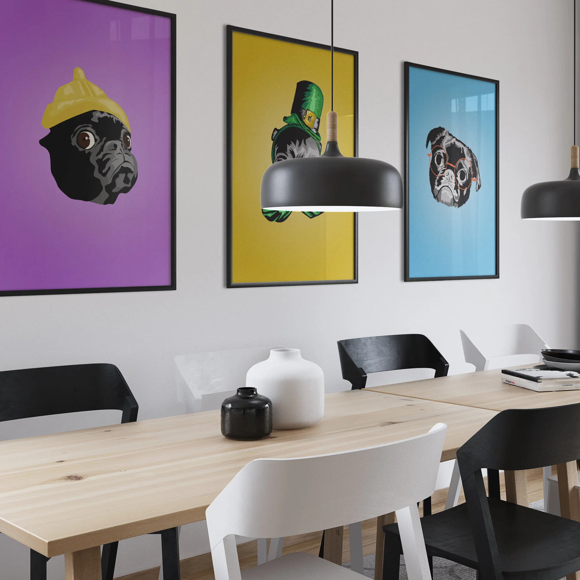
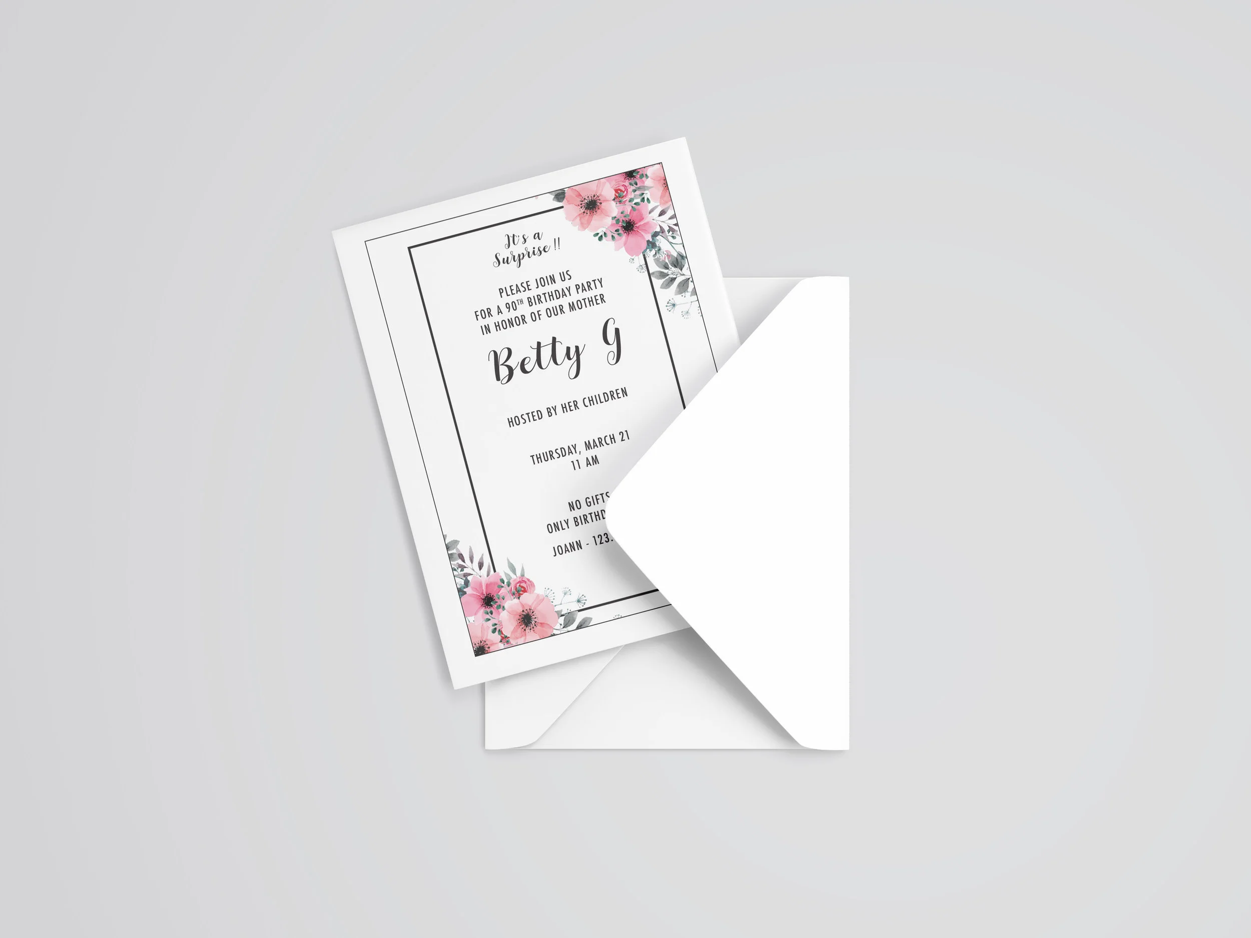
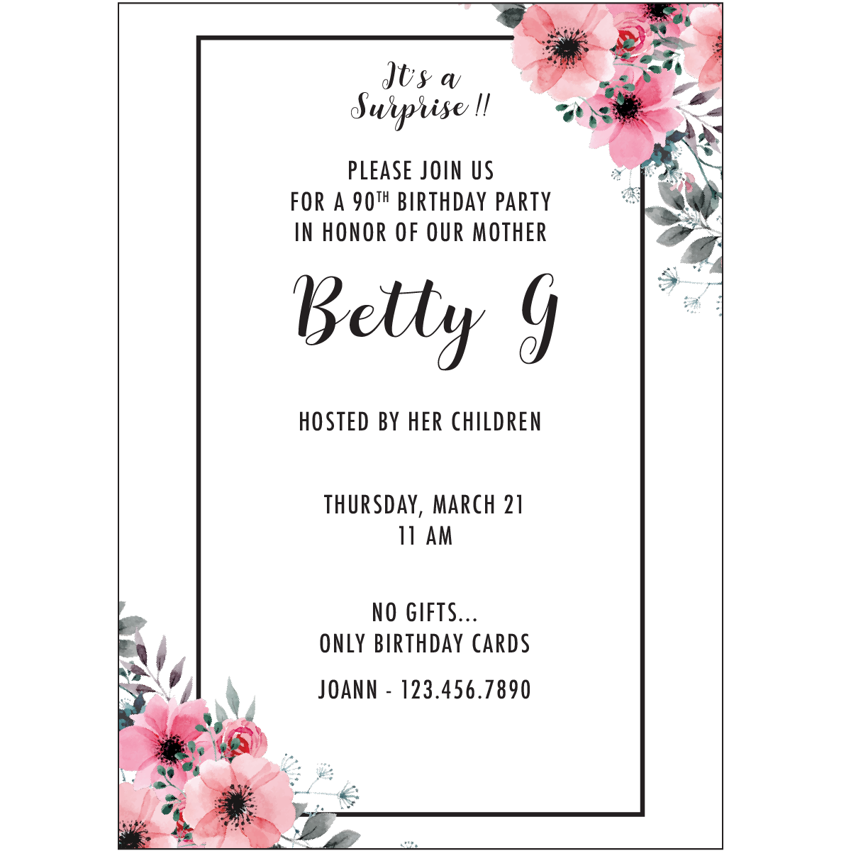
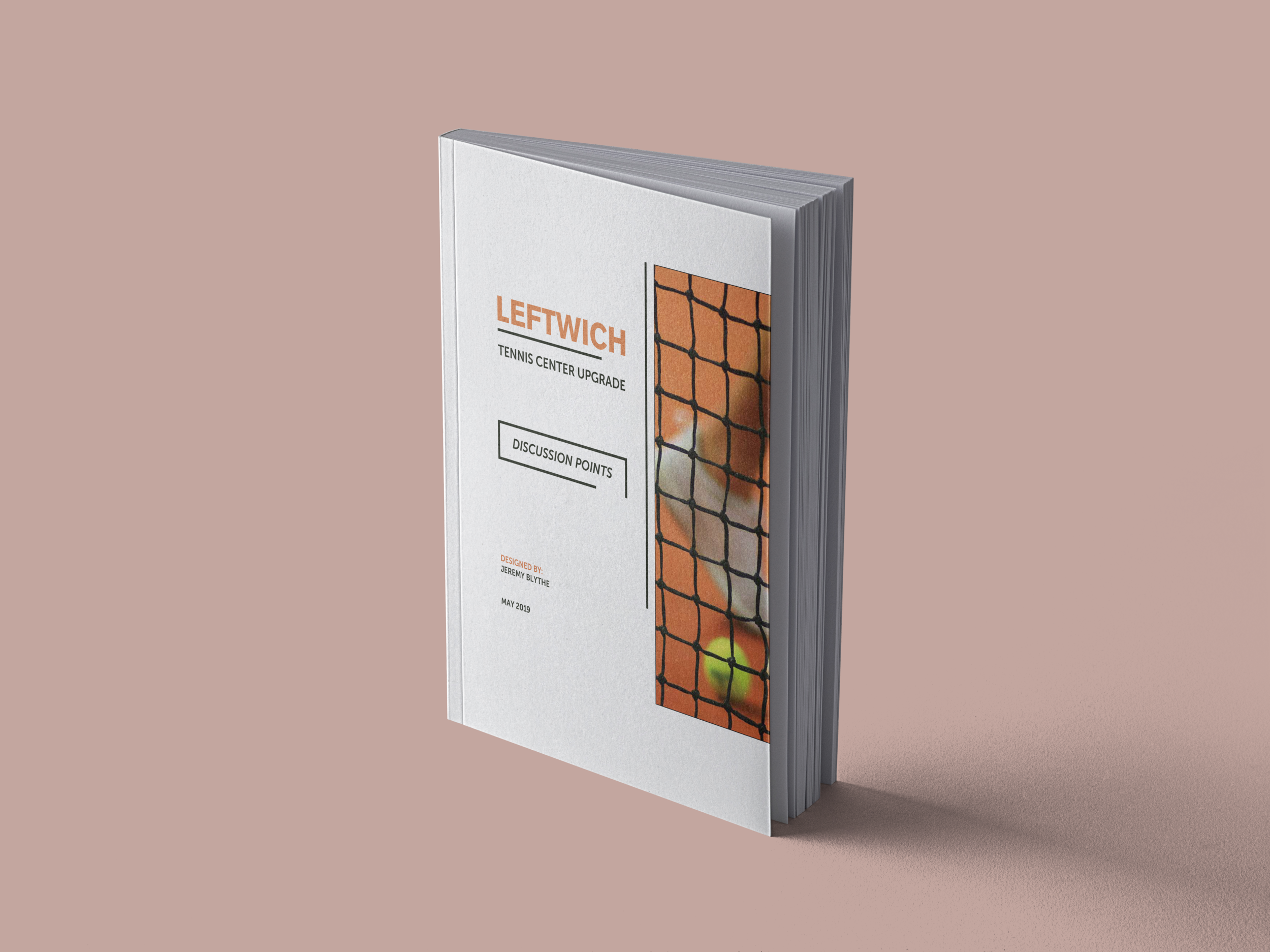
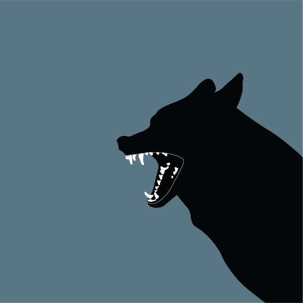
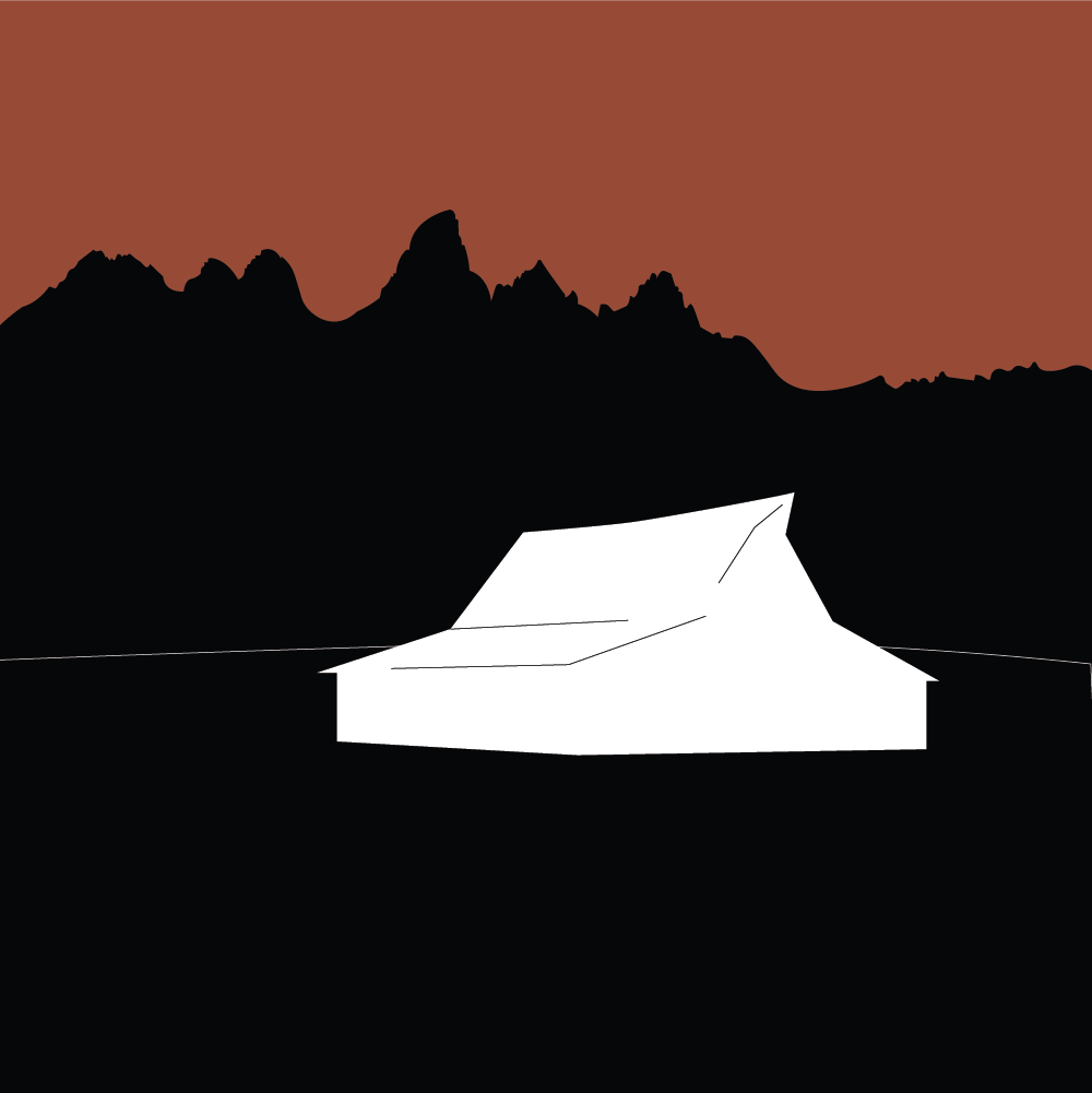
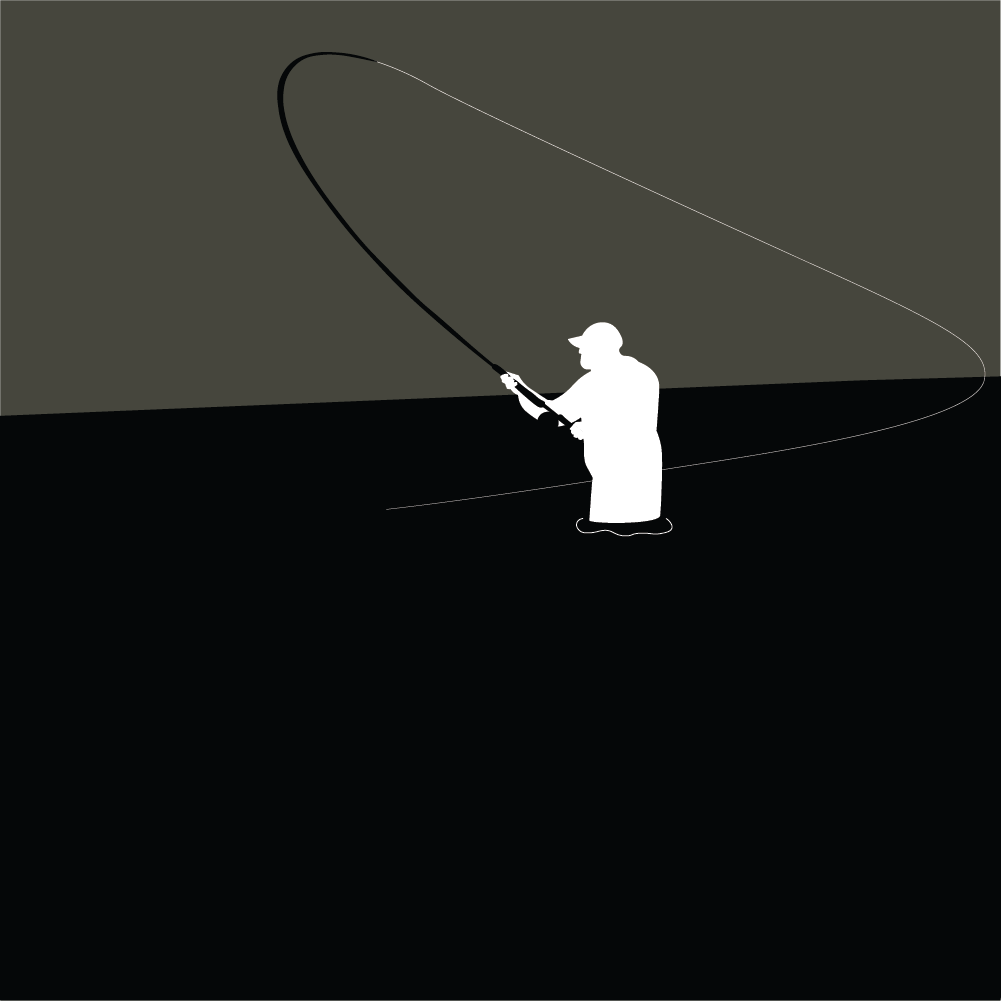
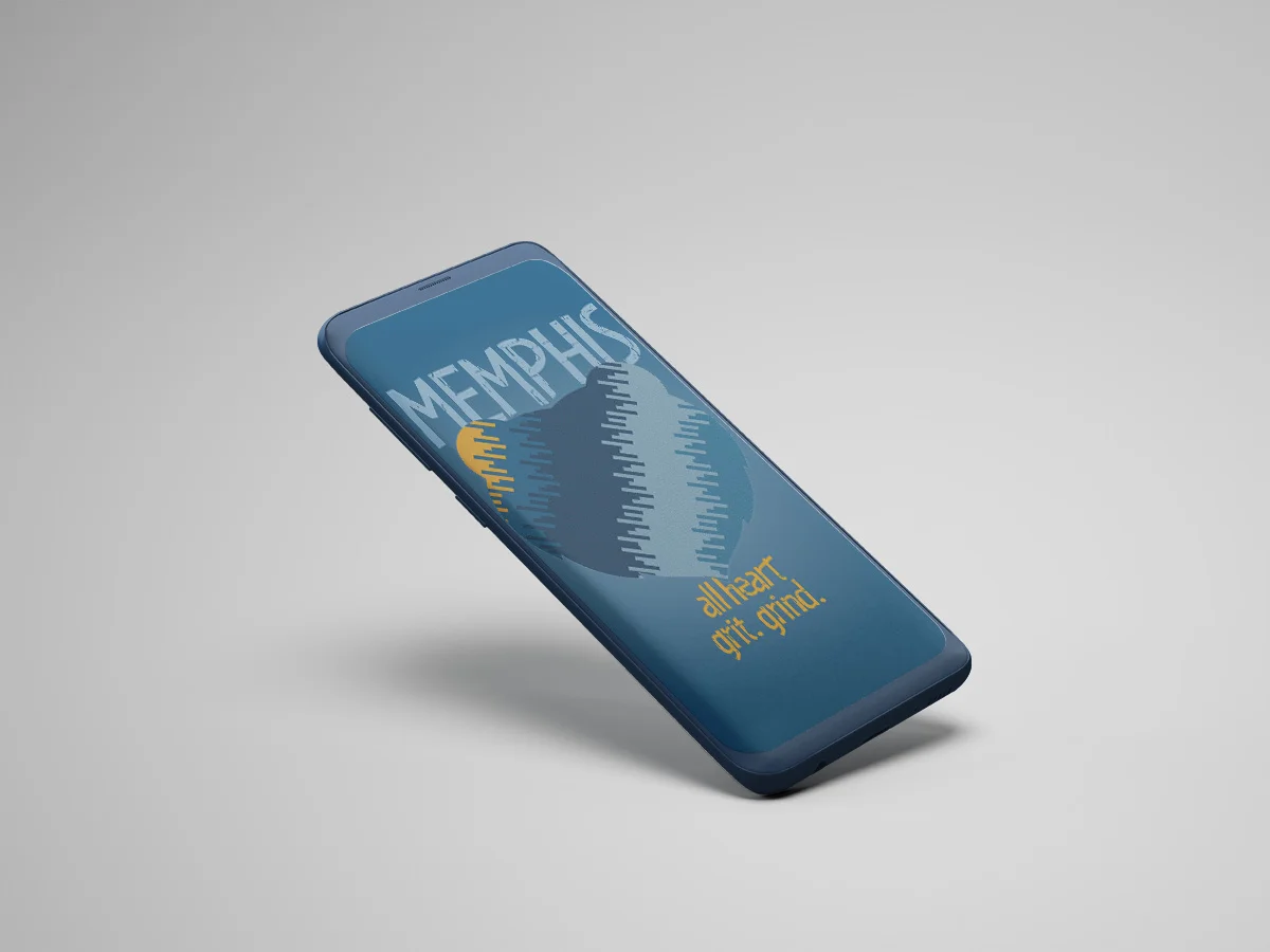
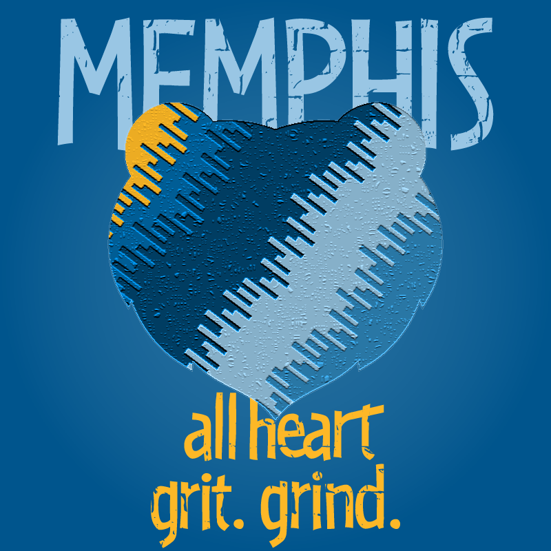
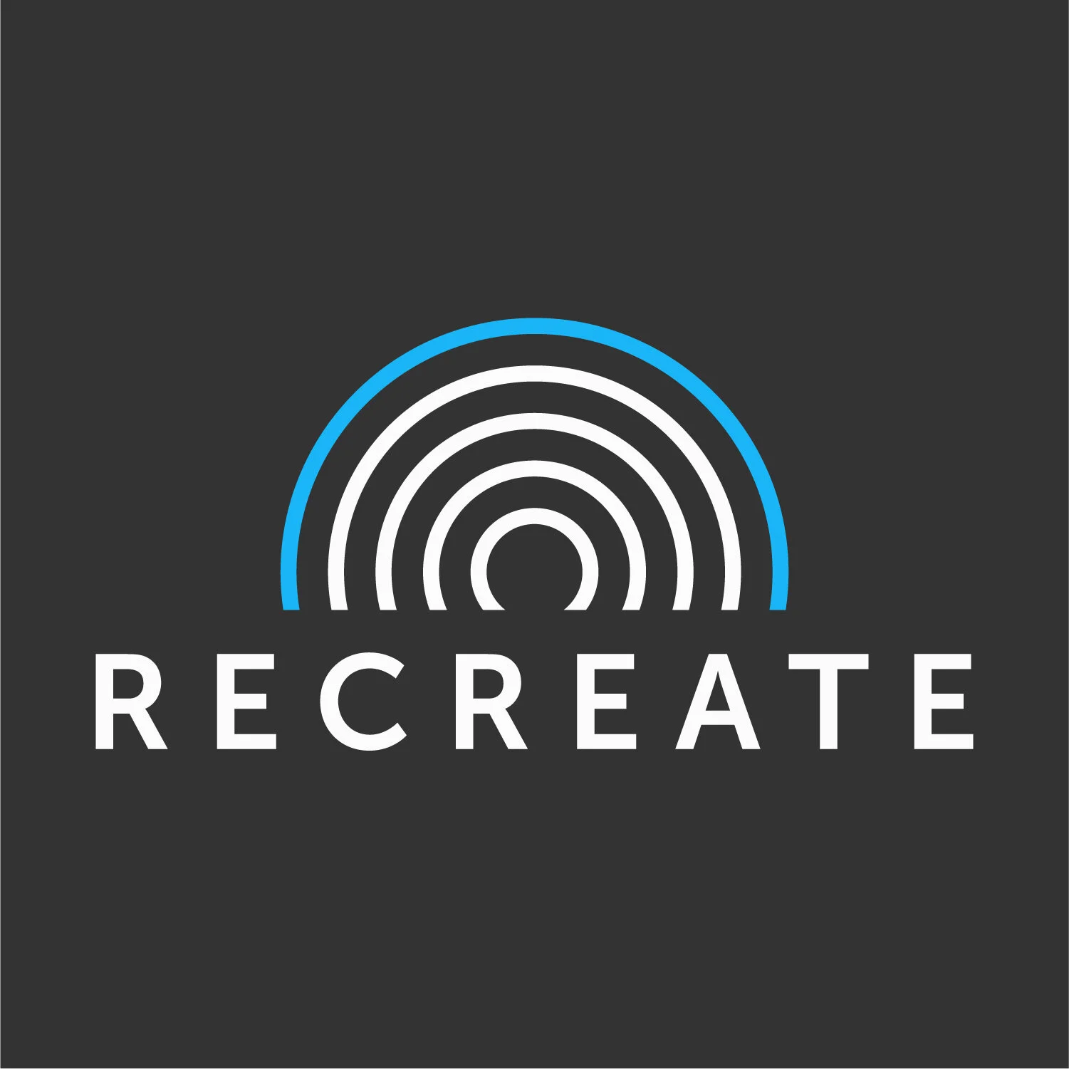
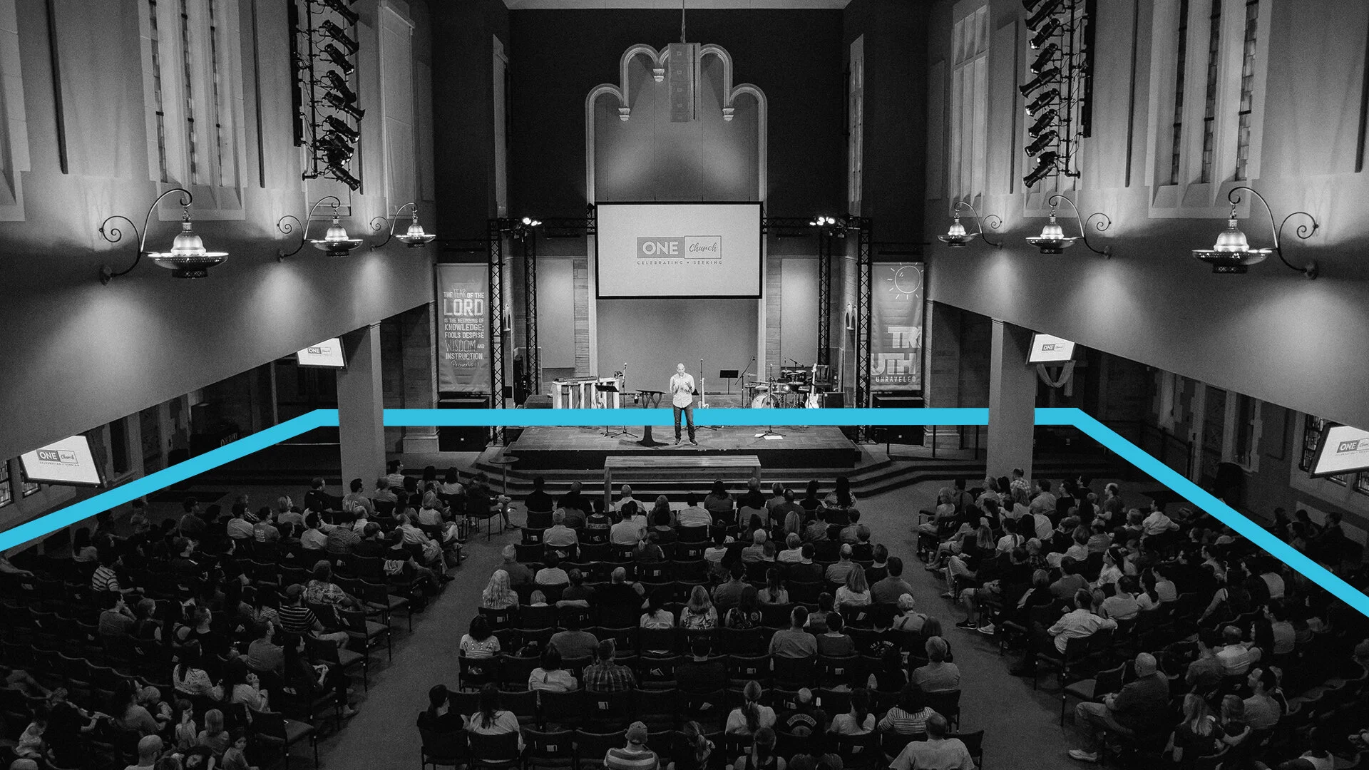
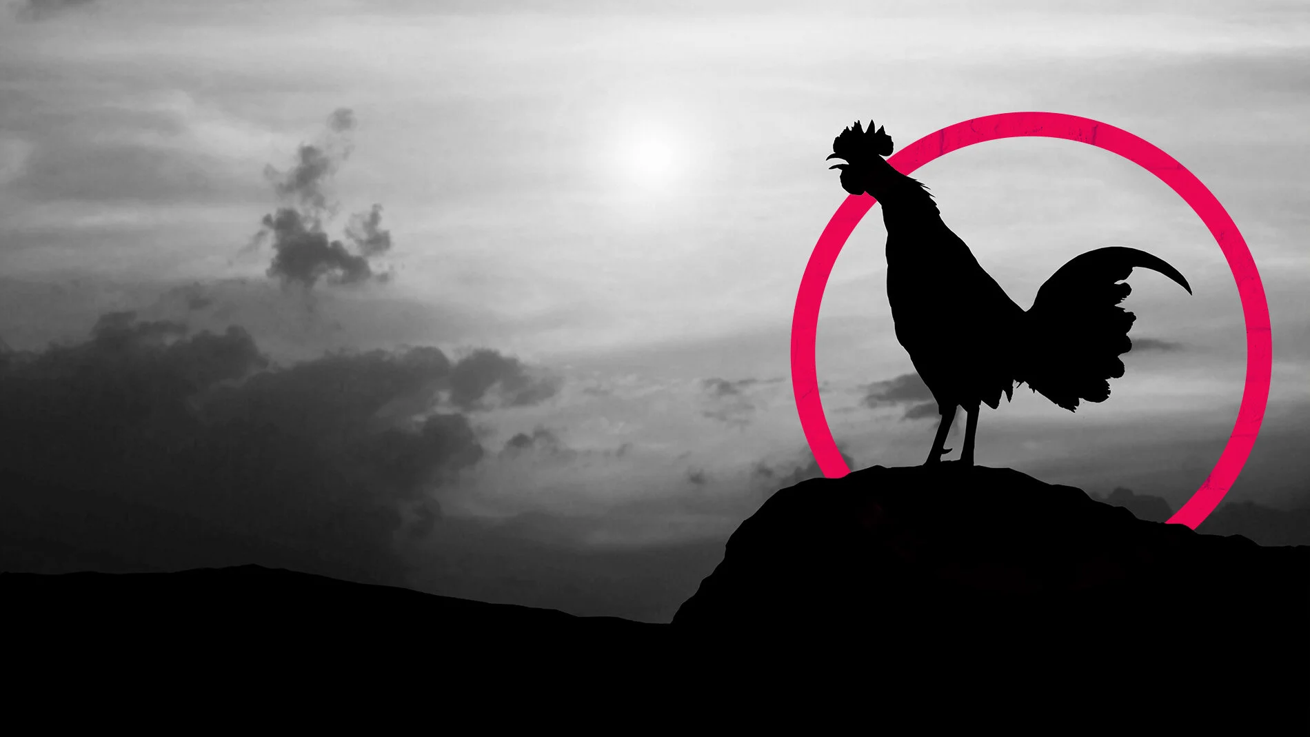
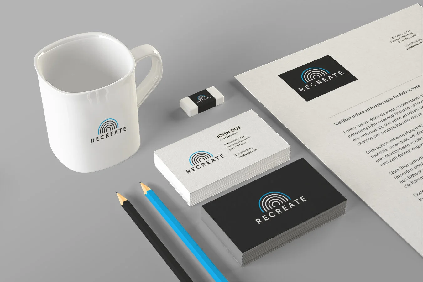
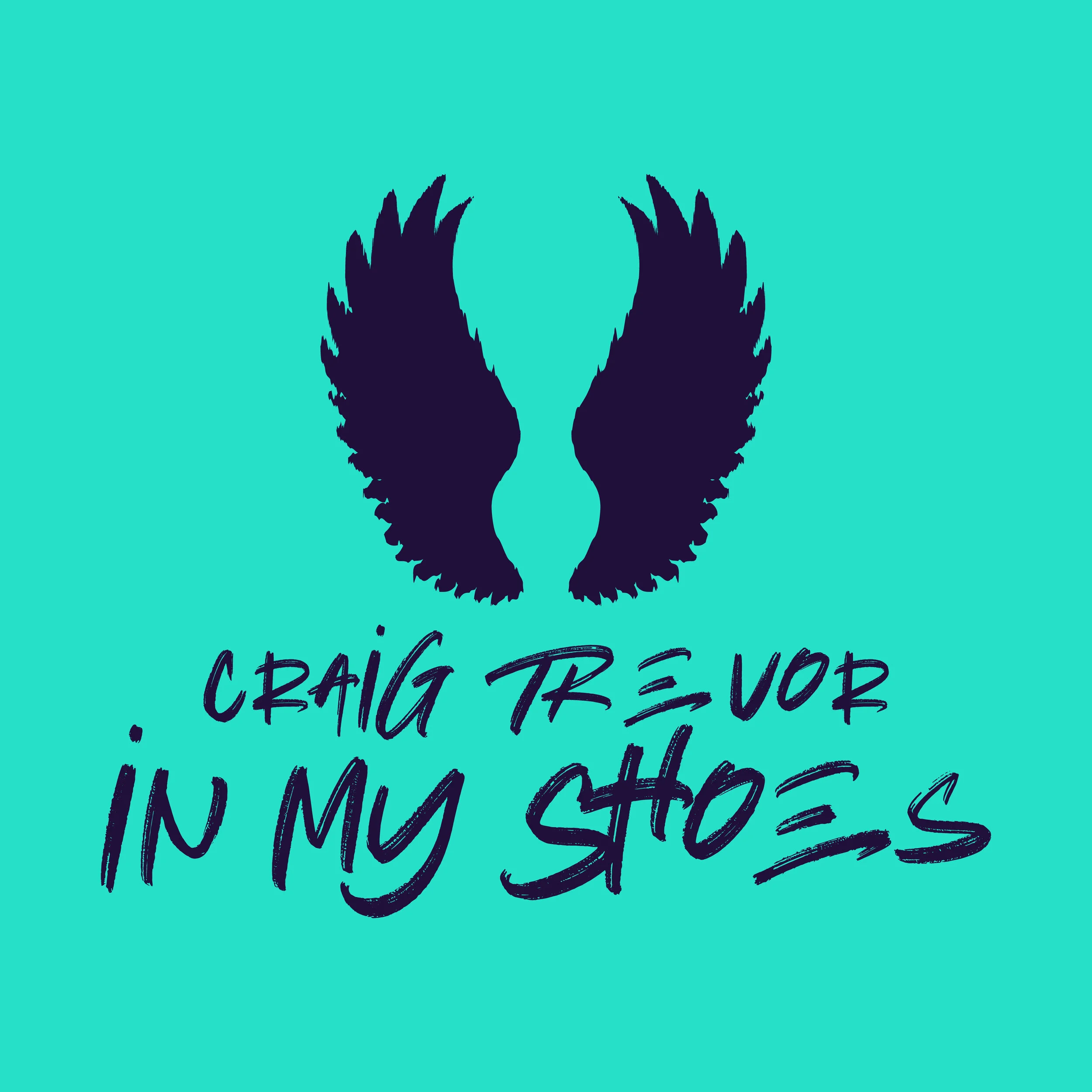
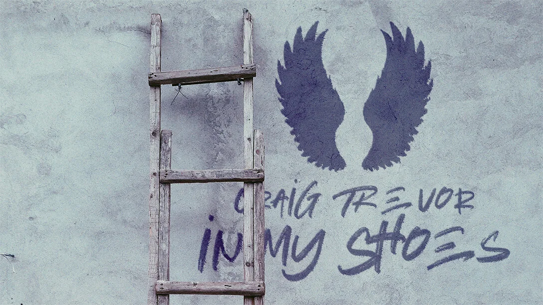
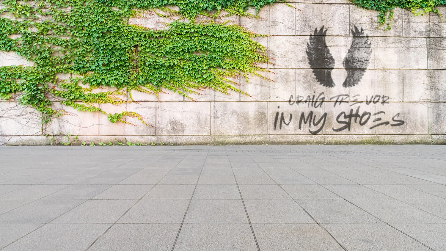
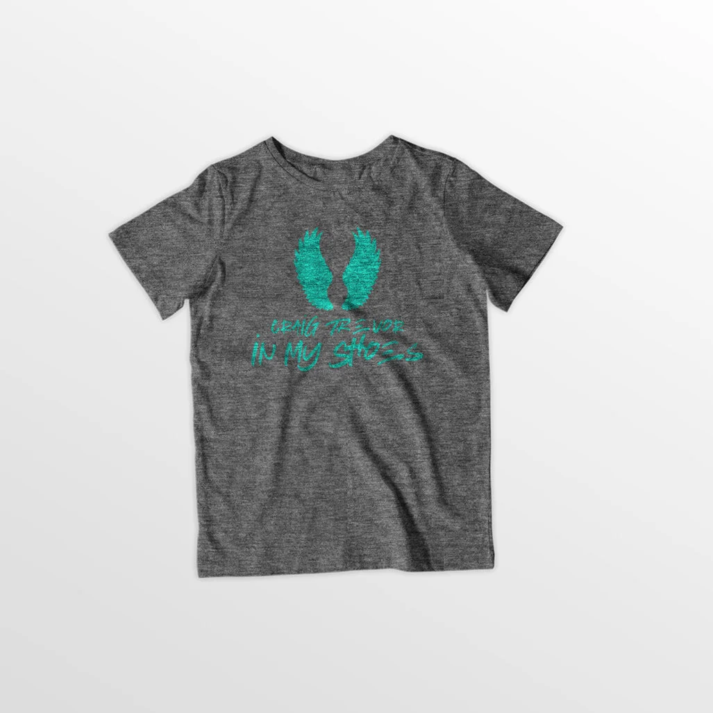
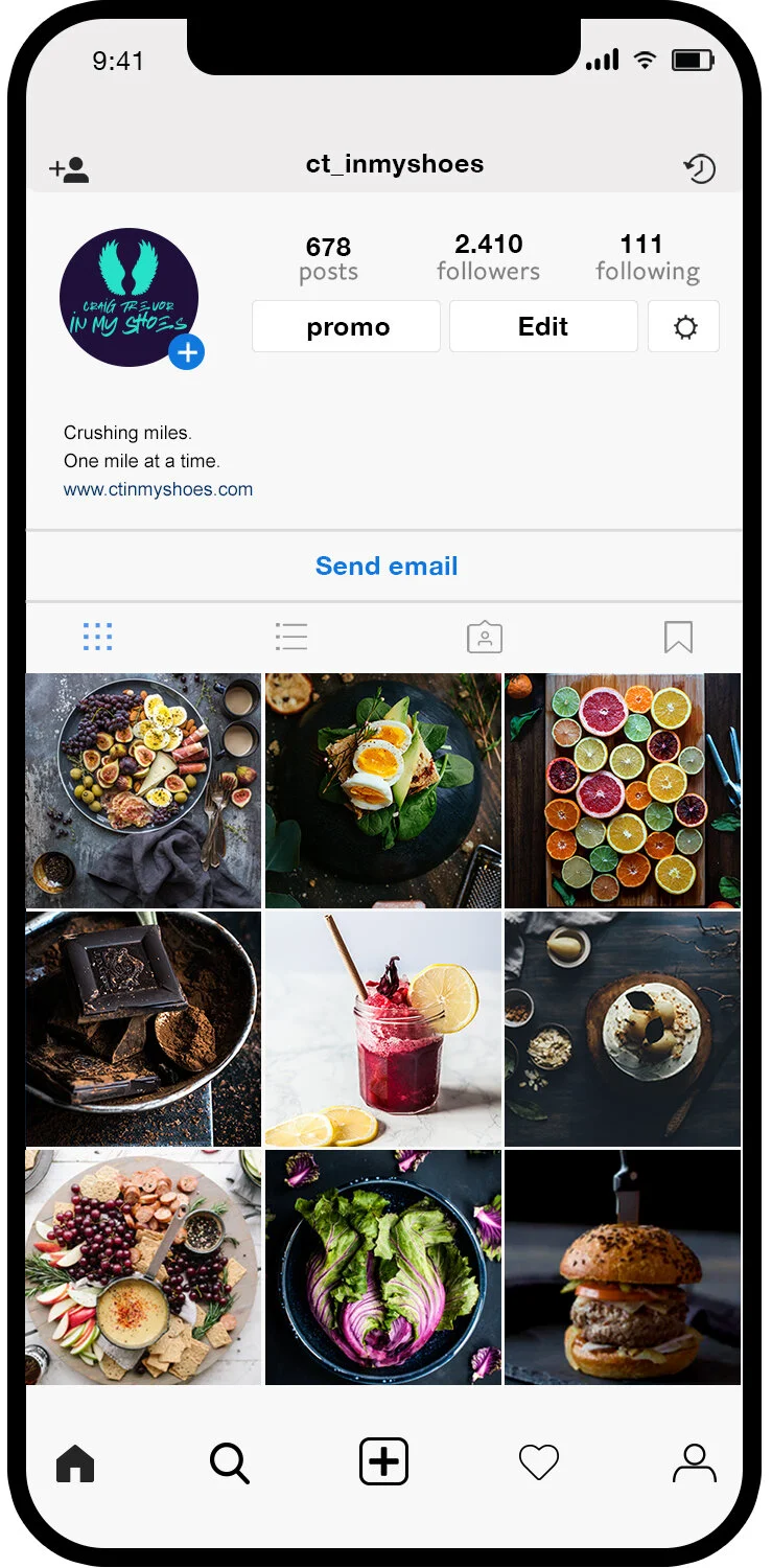
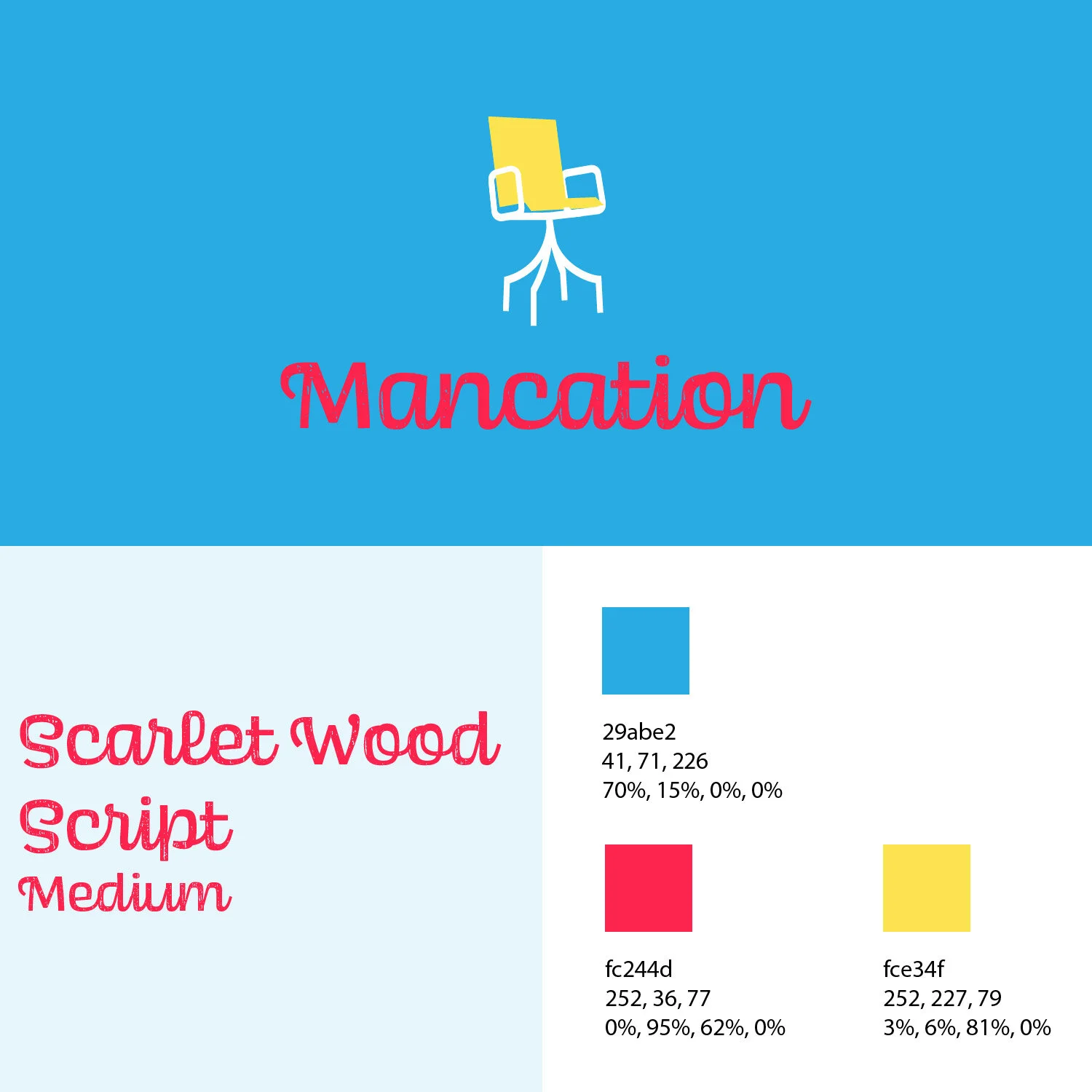
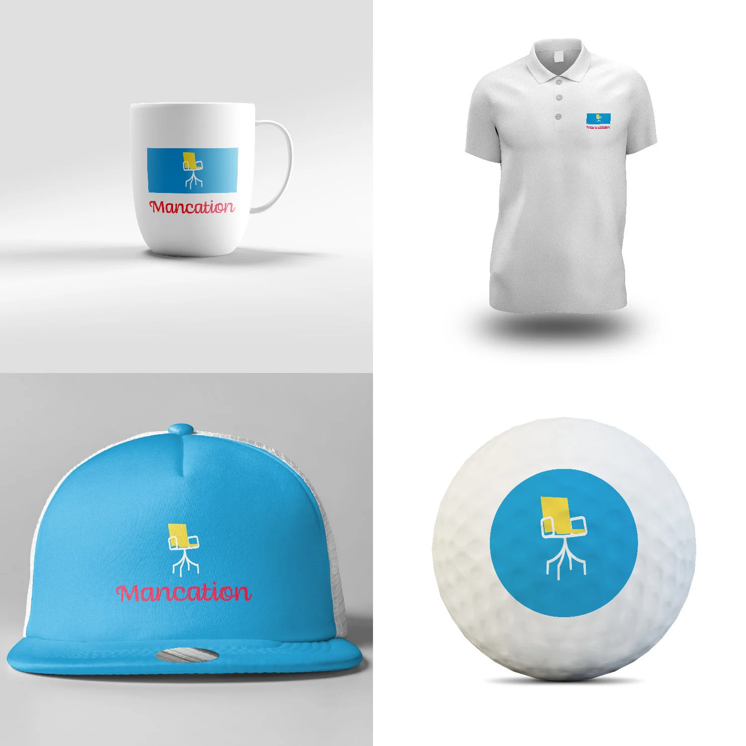
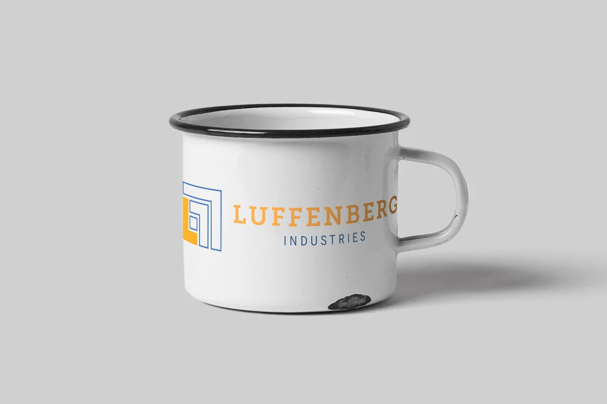
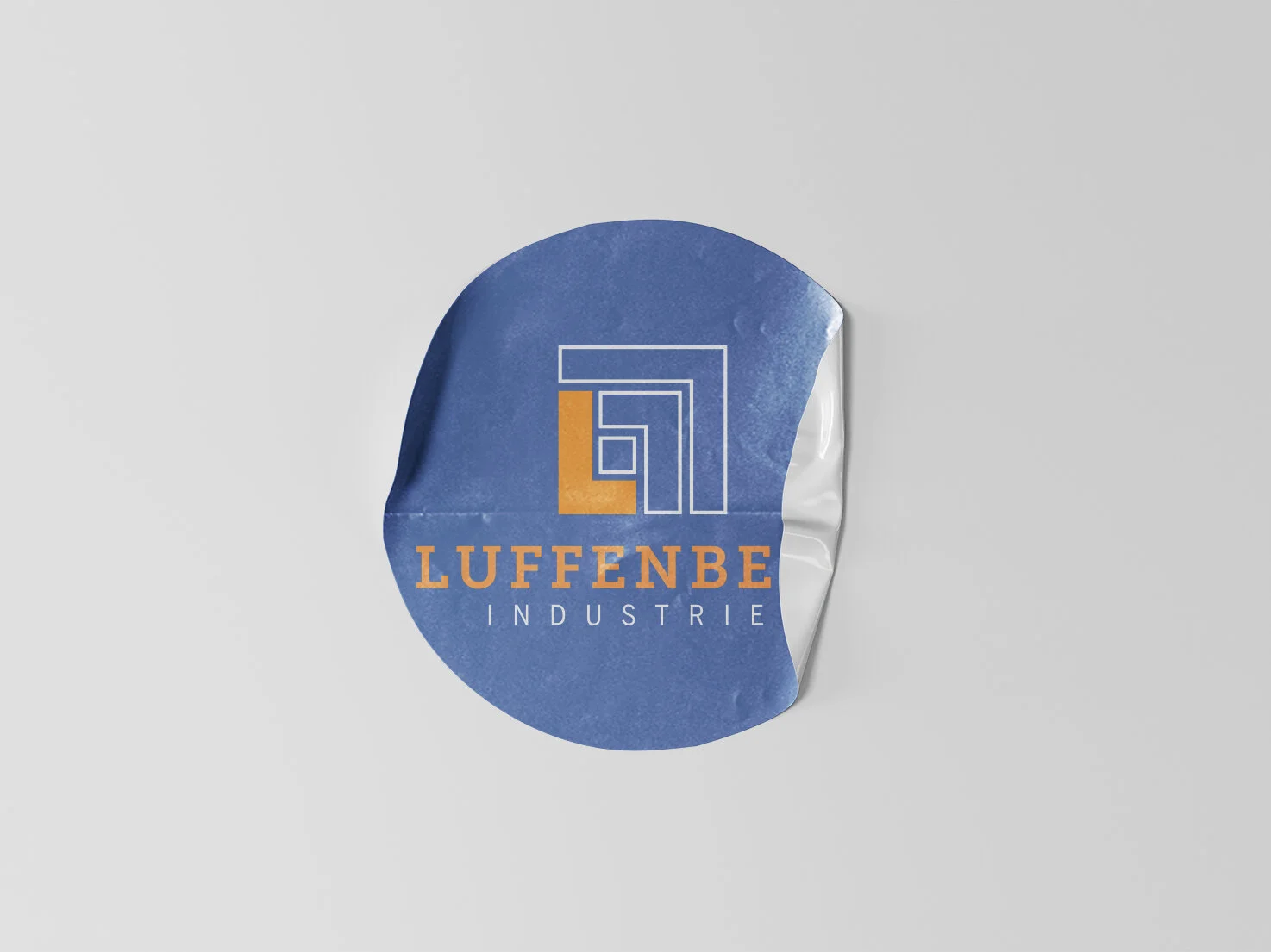
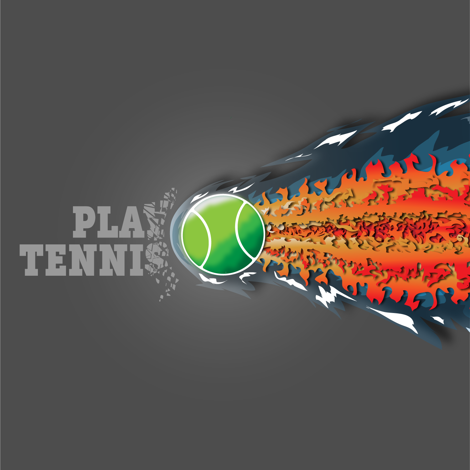
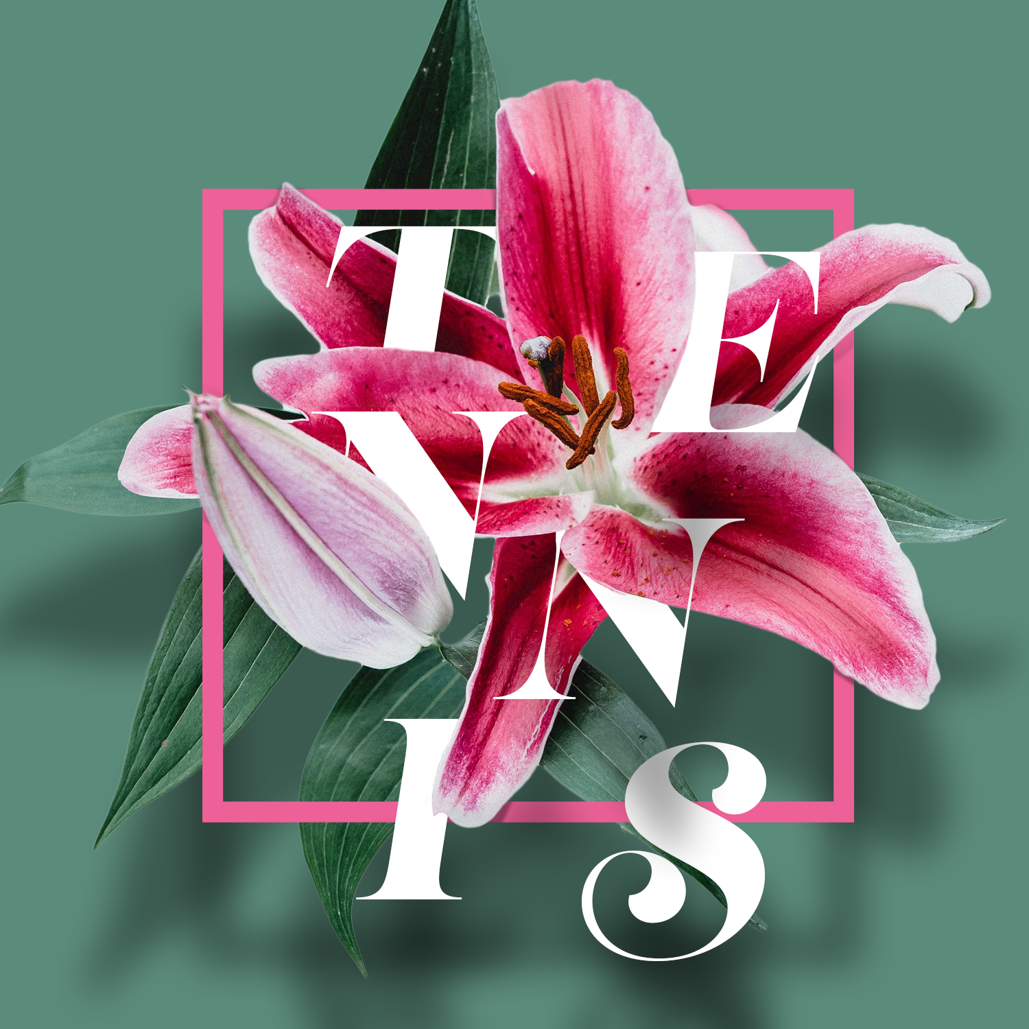
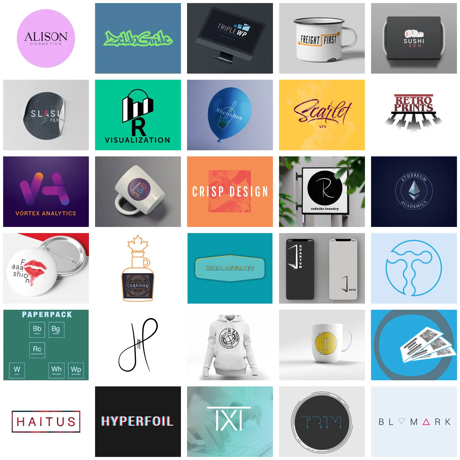
The use of triangles conveys two things: stability and direction. So, in terms of branding and marketing, the blue triangle represents doing the hard work of introspection and honesty to find the stability and clarity necessary to build a brand. The red, on the other hand, exhibits an explosive takeoff, launching off the pad of organizational health, and expressing the unique culture and offerings of the company.
Find clarity. Rise above the clatter. Become unforgettable.
Recreate Solutions is a company that works with leaders and organizations to get healthy. They really do inspiring work!
The direction we ended up going, in terms of look and tone, is solid and clean. The blues and grays suggest strength, and the simplicity invokes clarity. No fuss. No BS. This reflects the authentic identity of the company, and also expresses how they want to communicate with potential clients.
One big thing that kept coming up in the early process, is the desire to communicate optimism. Often times, they are hired to step into messy situations, so they want folks to know that it might be really bad right now, but together we can figure this out. There will be some tough truths to face, but a new day is coming. Hence, the sunrise icon.
This one was a lot of fun. This client created a social media presence where he shares stories, inspiration, and wisdom from his life as he pursues better health.
The stylescape that excited both of us is the one I called, “Wangs.” It features a strong urban vibe, using cool walls and textures to showcase the angel wings icon, which stems from his dozens of photos in front of street-art paintings of wings.
Established in 2009, eight college buddies have met annually on a beach in Florida. Since all of them are now dads, they jokingly refer to it as “Dadcation,” but it’s true branding lies in its original name, “Mancation.” The group wanted a logo that they could put on coffee mugs, golfballs, and one member even had it embroidered on a pair of Reebok Pumps!
The idea of the yellow bar stool/chair came into focus as I talked with guys and looked through years of photos. They played golf, went to the beach, and the like, but most of the time they chopped it up on the balcony around a table, sitting in these yellow chairs. It was not the only design I presented, but it was quickly accepted with great enthusiasm by the group.
For the font, I wanted something whimsical and beachy, and this typeface fit the bill, reminding me of driftwood along the shore on a morning stroll.
I was asked by the next-in-line CEO of a real company (I’ve changed the name as the process is ongoing) to give a redesign of their current logo, so she could show her boss a sample of a possible new look. As my goal was only to provide something to spur conversation, I skipped creating any Stylescapes and limited my research phase. These are steps that I will revisit later in this particular process, since we’re waiting on the higher ups.
Essentially, I kept the concept of an abstract, aerial view of a big AC unit that goes on the roof of a large building - as you might have guessed, the company is niche in a niche industry.
I did a few things to freshen it up:
1) In the original design, the “L” was not distinctly an L: it was equally as long as it was tall, so looked more like two sides of a box. I tweaked it so the L is immediately recognizable.
2) I made it point “up and out,” essentially changing the “direction” - which, may or may not be a big deal, but I think it insinuates progress and growth, subtly saying, “We’re going places!” In the original logo, everything is aiming down at the corner of the “L,” which is just not as strong.
3. I totally changed the color scheme. The original is built on a deep purple, and the adding tints of white to each layer of the “L,” and it just felt dated. The goal of the brief was to inject a bit more modernity into the design, and the client mentioned they had recently been using an orange on their website. I landed on the blue as a pair, which invokes strength and wisdom. This company has been around for decades, so I thought tweaking the original concept was a nice nod to heritage, but redesigning the icon and color scheme was a simple way to bring it up to date without going crazy.
4. Lastly, I updated the font - giving it a big, slab serif (Again a nod to heritage), but with a bit of extended tracking and kerning, and paired it with a clean, modern sub-text to really bring it around.
The client is thrilled and absolutely loves the redesign. We’re just introducing change at a rate she thinks her boss can absorb!
One of the big challenges when it comes to creating content for a small tennis retail store, is putting things on social media that is not “sale-sy.” I create #playtennisyall to accomplish two things:
1) Give the customer base custom-made images that support and encourage the game that they love, without directly promoting one of the stores. I chose to embrace the “y’all,” as the stores are in Tennessee, and how business and online sales goals are to gain more market share in the mid-South.
2) It’s home base for User Generated Content - they can post, see, and interact with us (and our brand) on a more personal level, instead of a business/corporate-y one.
This is just a sample to show the variety and styles of the #playtennisyall campaign.
The idea to create a poster series was inspired in a moment I had with my daughter. She was hanging out in my office while I was going through some stock photos on my computer. When she saw the picture of the pug in the yellow hat, she completely lost it. It was just the cutest, funniest picture she had ever seen. I thought, “I can do something with this!” I spent the next few hours creating these cartoon heads of pugs, using both the pen tool and my Wacom tablet, and now both of my daughters want the series in their rooms!
I was asked to create an invitation for my wife’s grandmother’s 90th birthday. Given that most of the folks receiving the invitation were going to be around her age, I went for clean and legible.
I was asked to put together something to help get a large group of stakeholders on the same page to undertake a massive project of building a world-class - and expensive - regional tennis center. It essentially included a history of the current tennis center and its founder, a description of the tennis landscape in the city (after losing a ATP event and a prominent tennis club), and all the topics and questions that needed attention to move forward. The thirty-five page document was presented to a variety of people, including the mayor, represents from the local University, philanthropic board and directors, and other representatives from the local tennis community.
My Dad loves Wyoming, so I made these for him. They now hang in their hallway. Each image depicts an experience we’ve had in our few trips out West.
My brother and I are huge Memphis Grizzlies fans, so I created this for him as a Christmas “happy” gift. I have no idea if he uses it, but it commonly features on my phone!